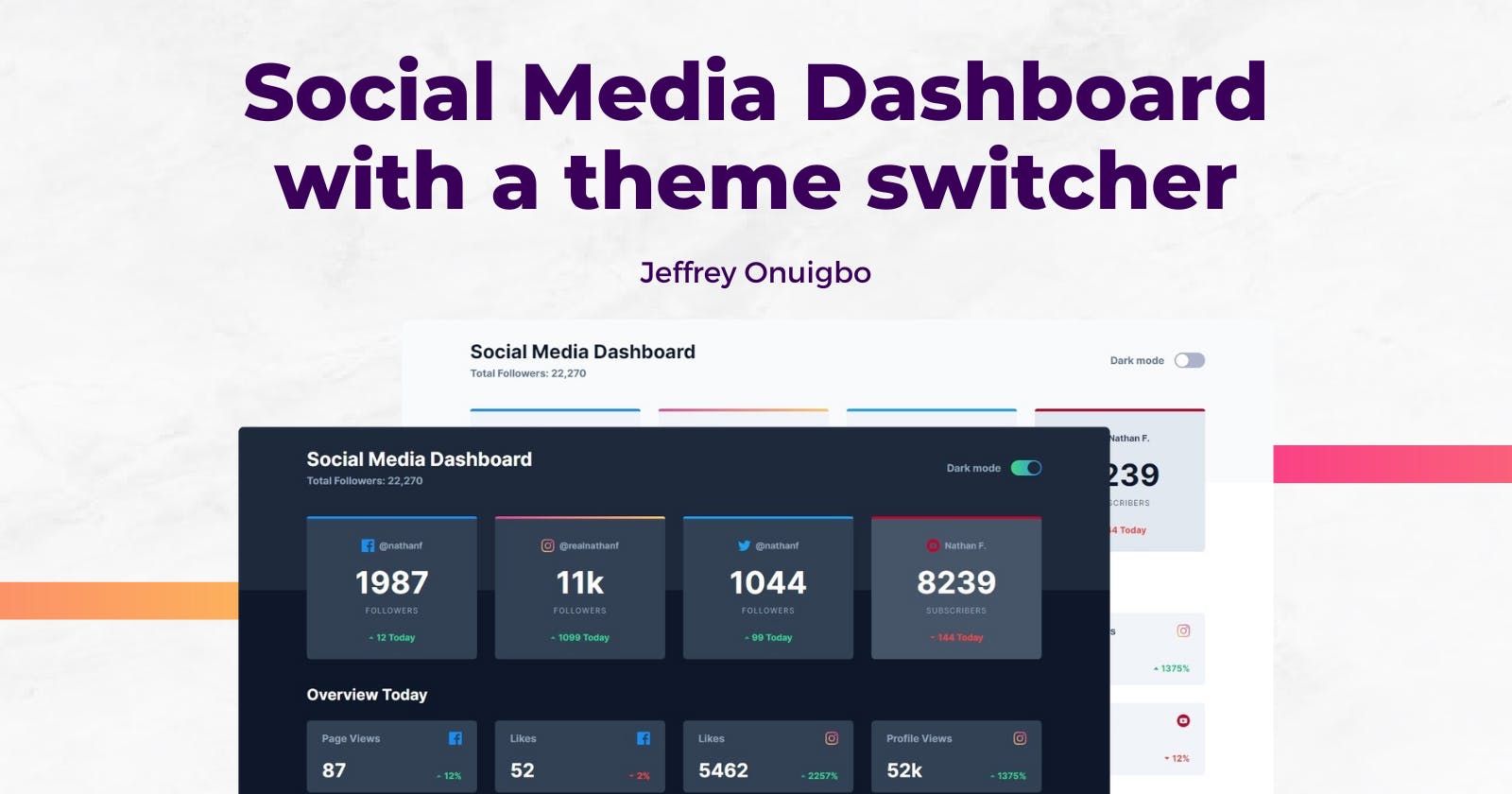
I built a Social Media Dashboard with a theme switcher. Here's everything I learnt


After learning about React Context, I wanted to test out my knowledge by building something, so I chose this challenge from Frontend Mentor to build a Social Media Dashboard with a dark mode theme switcher.
I built it with React, Context, TailwindCSS, and Vite. I deployed it to Netlify as a static website and you can view the live project here
In this article, I will explain the process of how I built this, the challenges I faced, and a couple of new things I learnt along the way.
Let's dive in.
Challenges
Most of the concepts I implemented here were entirely new to me at the time, but through relentless googling, I succeeded in overcoming all of them. Some of them were:
1. Storing the data
From the start, I wanted to avoid hard coding the data into the components as much as possible, and over a few iterations, I came up with this data structure for storing information about a platform and their metrics
import fbLogo from "../assets/icon-facebook.svg";

{
        name: "facebook",
        logo: fbLogo,
        userHandle: "@nathanf",
        following: {
            metricName: "Followers",
            amount: 1987,
            change: 12,
        },
        otherMetrics: [
            {
                metricName: "Page Views",
                amount: 87,
                change: 12,
            },
            {
                metricName: "Likes",
                amount: 52,
                change: -2,
            },
        ],
    },
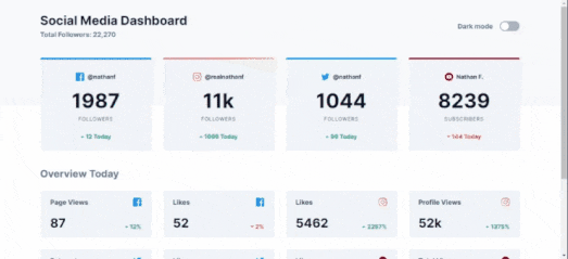
According to the design below, following was styled differently than the other metrics, so I had to lift it into its own key for easy access as opposed to storing it inside otherMetrics.
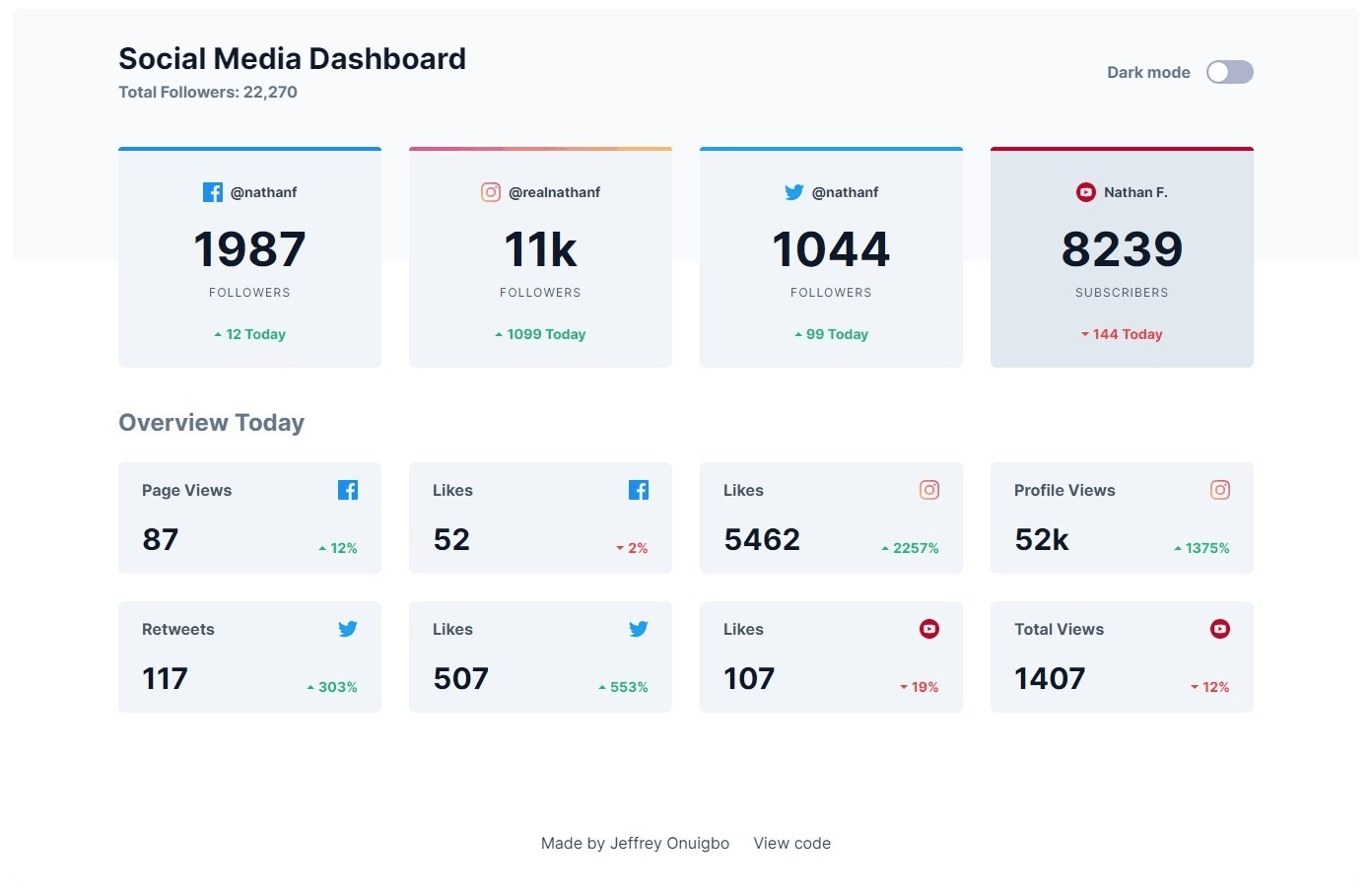
The data structure above is the same one I used for other platforms shown in the design. I stored them in an array called dashboardData that I used as the Context for the entire React application. You can view the Context data here
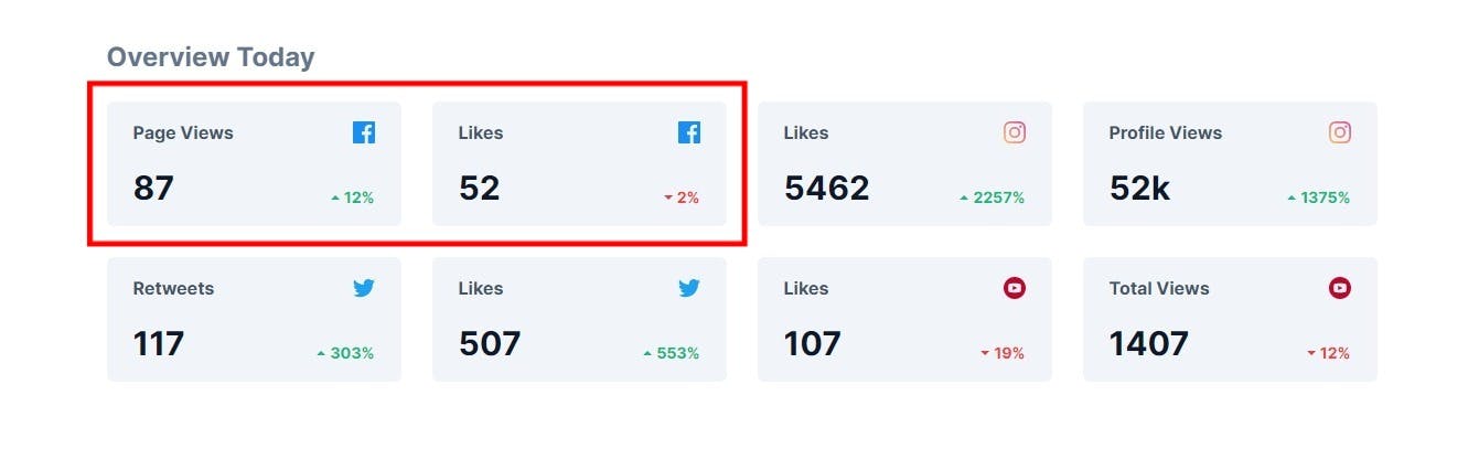
2. Rendering the data
Looking at the design, I had 2 reusable components to build: a FollowingCard and a PlatformMetrics component.
The FollowingCard consumed the context of the current platform in a rendering loop and displayed the contents of each platform's following object
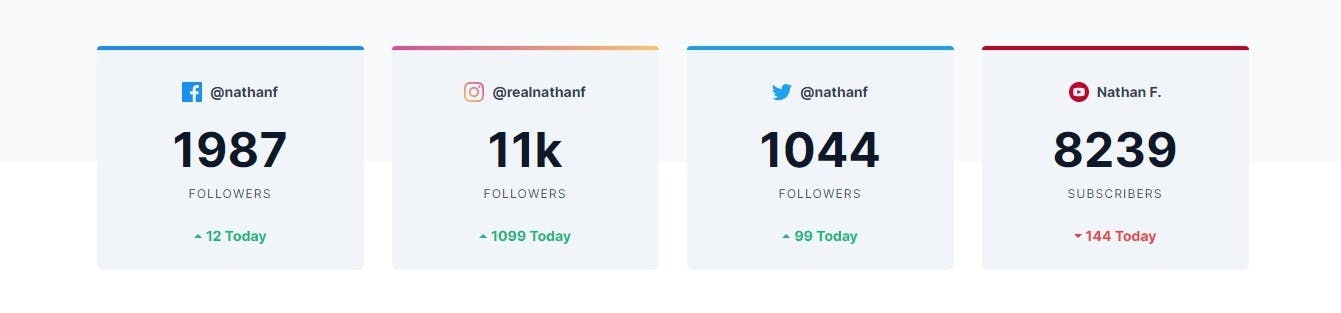
Using the name key of a platform, it adds a dynamic class that I used to style the top border of each platform differently.
The trend shown below is rendered as rising or falling depending on the polarity of the followers.change key stored in the context.
Tip: If you want to learn how I added the gradient border on Instagram above, here's an in-depth article I wrote about it
Also, I learnt how to render large numbers like 11000 as "11k" instead and I think this will come handy when summarizing large numbers in the future (Eg: Video views etc)
Now for the PlatformMetrics component, it loops through the otherMetrics array for each platform and renders each metric, while the app loops through the platforms and renders PlatformMetrics 4 times.
This is one component actually...
I tried structuring the component to render a single metric from otherMetrics for each platform but that got complicated too quickly so I went with this implementation instead
Also, it reuses the trend polarity and number shortening functionality as in FollowingCard
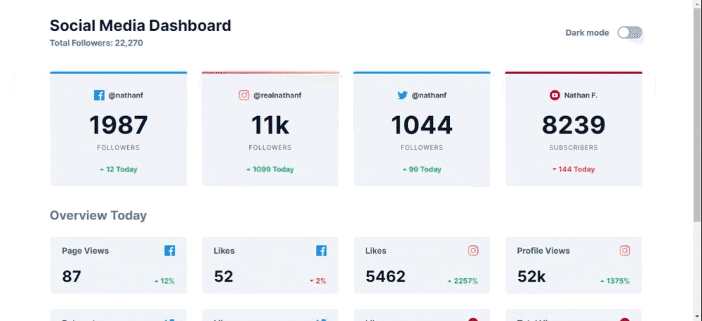
3. Dark theme switcher
Besides using Context, this was what actually drew me to this project. If there is a dark theme on a website or app, I'm clicking. My eyes have never been better and I appreciate all the designers who invented this UX.
So I wanted to learn how to implement it myself, and I already knew TailwindCSS had good support for it, so the implementation wasn't that difficult.
All I did was create a stateful boolean value (darkMode) mapped to a switch component I swiped from a tutorial online. The switch component uses a checkbox input underneath so clicking it toggled the state.
Finally, I used that state to toggle a dark class on the entire app, which tells Tailwind to use styling classes prepended with dark: rather than the regular class.
Here's the theme switcher in action
If you want to learn how to implement this yourself, I recommend you check out the official docs for the feature itself, it contains everything you need to set this up in your projects
Additionally, you can also target the toggleable
darkclass in your CSS and add some sort of transition to ease the switch between light and dark mode
4. Animations
The best part about this project was when I implemented a loading screen animation and animated the components to gradually appear on the screen.
For this i used a library called Animate.CSS, they have a bunch of just-add-water animations that you can add to your elements using classes.
Now, in order to gradually animate the platforms to appear one after the other, I used the index of each platform object while rendering them to add a delay to the animation via a class.
The result was a list of elements appearing one after the other.
5. Deployment
As usual, I deployed the website to Netlify.
Here's the Live Project
You can also view the source code on GitHub
Conclusion
All in all, this was a fulfilling project, using animations and setting dark mode in my projects has always been something I wanted to learn and i'm surprised I didn't need to write much custom CSS for this.
What remains is to implement this into my portfolio to improve it's design. But that's til the next iteration.
Also, I believe there're better ways to implement parts of this project, so I'll appreciate some feedback on this.
Thanks for reading so far, If you have any questions about what I did, you can comment them below.
Finally, you can connect with me online via any of these platforms
Have a nice day.