How to add gradient borders to elements in HTML
Spice up your elements with smooth gradient borders

Hi, i am a software engineer and designer from Nigeria with a deep interest in building saas software and tools
On the side i write about coding concepts and reverse engineer stuff built by people before me
If you would like me to build something for you, send me a line at jeffreyon11@gmail.com
xx Jeffrey
Adding borders to HTML elements is usually a simple task. But adding a gradient border is not so straightforward.
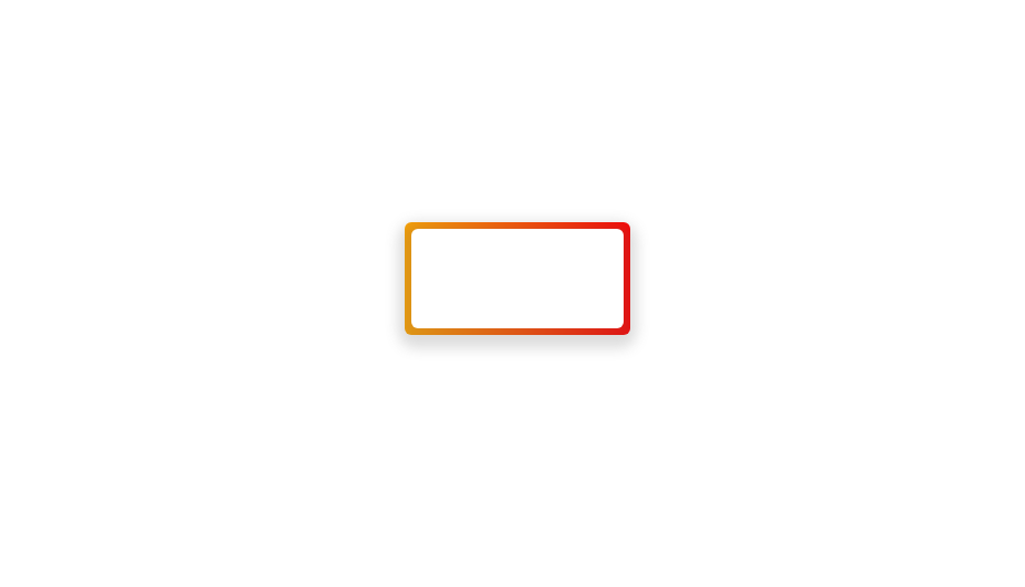
In this article, I'll show you how to easily create a gradient border like the ones below for your DOM elements.

How it works
Creating a gradient border is not natively supported by browsers or CSS in general, but we can create that effect using a simple trick...styling pseudo-elements.
By styling ::before or ::after pseudo-elements as borders, you can create gradient borders easily on any target element.
Creating the border
First off, give your target element a class or id, then in your CSS file add a relative position property to it and create a pseudo-element after that like so:
.target {
    /* Other properties */
    position: relative;
}

.target::after {
}
Now let's add some styling to the pseudo-element to become our border
.target::after {
    content: '';
    position: absolute;
    top: 0;
    right: 0;
    left: 0;
    bottom: 0;
    z-index: -1
}
Here's what's happening above:
First off we add an empty
contentproperty to have something to style, then we position it absolutely and stretch it to fill up the width and height oftargetusingtoptobottomproperties set to0After that, we place it behind
targetby setting it'sz-indexproperty to-1.
After that, we can now style our border like so:
.target::after {
    /* Other properties */
    margin: -5;
    background-image: linear-gradient(to left, red, orange);
}
Let me explain what I'm doing here
We set a
marginproperty to a negative value and this makes the pseudo-element pop out behind its target, just like a regular border would. We can adjust this value to alter the thickness of the border.Then, we add a
background-imageproperty and set its value to alinear-gradient()function. This adds a gradient to the entire body of our pseudo-element making it look like a border on its target element.
After styling those properties, you should see a colourful gradient border appear on your target like so:
If you don't know how to use linear-gradient, look for an article explaining how it's used or check out the CSS spec for the property
Customizing the gradient border
For more control, we can customize the gradient border further to fit any use case we want, here are a few options
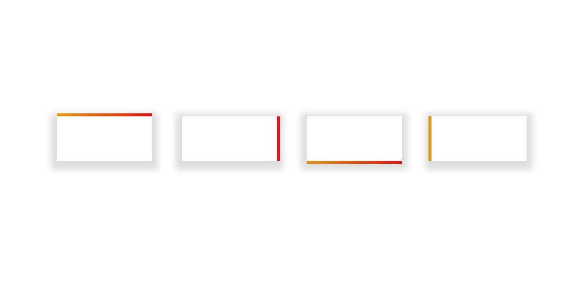
1. Custom border sides
You can specify which border sides you want by adding a margin-(side) property on the pseudo-element like so
.target::after {
    /* Other properties */
    margin-top: -2px;
    margin-right: -2px;
    margin-bottom: -2px;
    margin-left: -2px;
}
This sets the top, right, bottom and left 'border' respectively. We can also use the margin shorthand property to specify them in a more compact way.
Any of the above snippets will produce the following results:
Tip: Make sure you change the direction of the
linear-gradient()so that the color change will appear on the border side you want to use
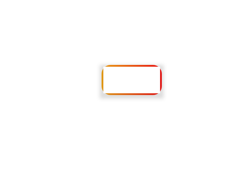
2. Rounded corners
You can round the corners of your gradient border in 2 ways
Adding a border radius to the pseudo-element directly with a value. Or
Inheriting the border radius of its target element
For the first one, simply add a border-radius property to the pseudo-element to round the corners (or the ones you want), like so:
.target::after {
    /* Other properties */
    border-radius: 2px
}
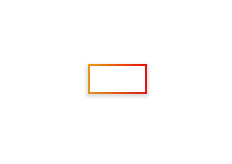
This will produce a gradient border with rounded corners like so:
Awesome.
The problem with this though is that our target element does not have a border radius and if you increase that of the gradient border, things start to get weird.
For instance, here's the gradient border with a border-radius of 10px
Just like that, the user has caught our deceit, they sue us for violating their precious user experience and we lose our kidneys.
Lol.
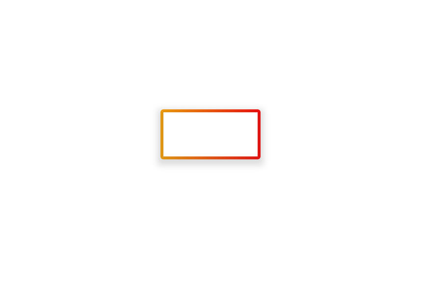
Let's fix that up by setting a border radius on the target element instead and inheriting that property on our gradient border:
.target {
    border-radius: 5px
}
.target::after {
    /* Other properties */
    border-radius: inherit;
}
This maps the border radius of the gradient border to the border radius of its target, like so:

Now anytime we alter the border-radius of the target, the gradient border inherits that value without any additional work.
Conclusion
In this article, I believe you've learnt how to create a gradient border and customize it to your taste.
I learnt this trick while building a small social media dashboard for my portfolio. If you are interested, here's a link to the Live Project.
Thank you for reading, and I hope this article helps you.
Finally, you can connect with me online via any of these platforms
Have a great day.


